Progress
Progress Basic Options
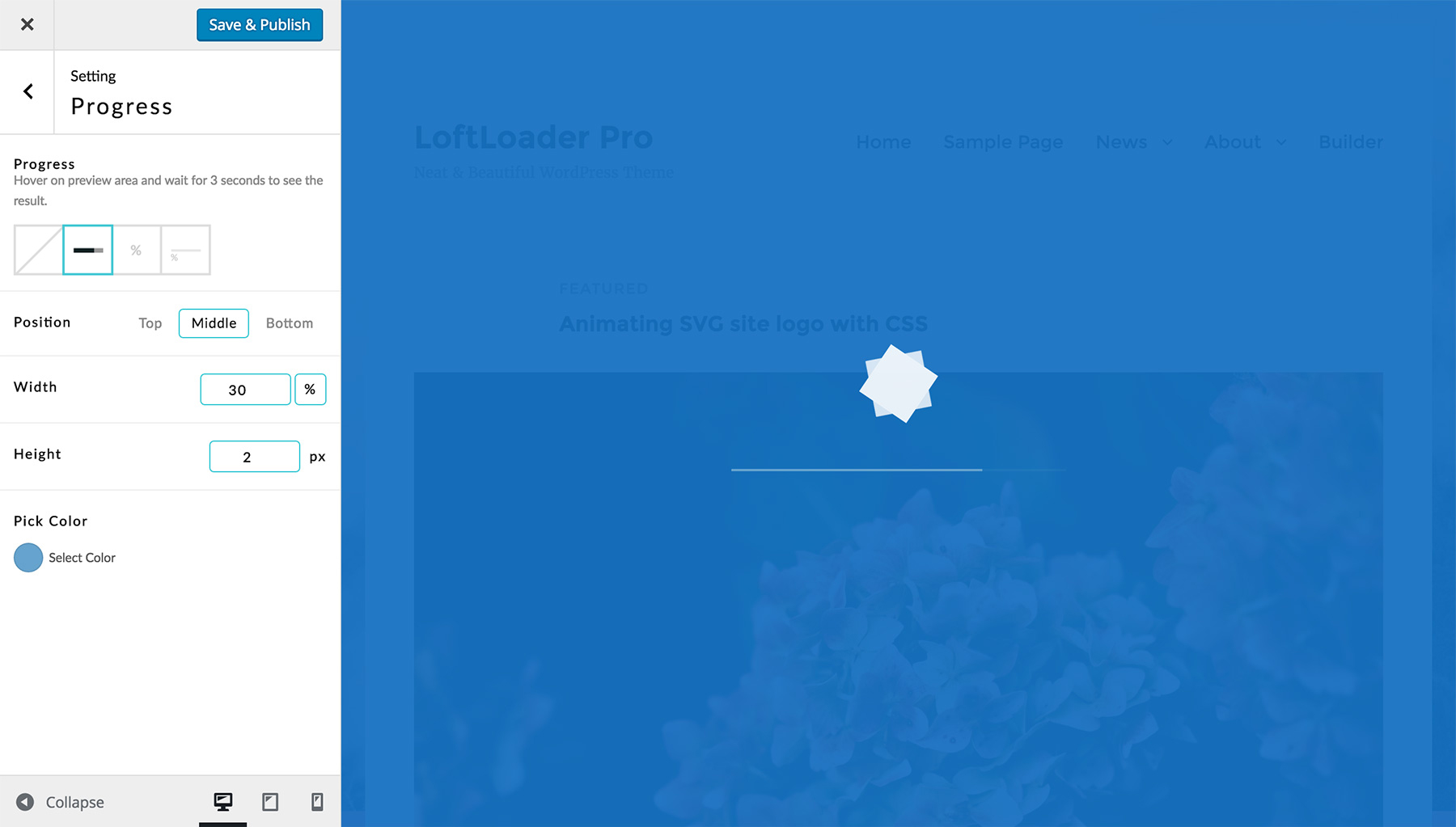
Click on the Progress section, then you can choose a progress indicator and style it.

Progress – 4 options: None/Bar/Percentage/Bar + Number.
- None – No progress indicator will show.
- Bar – Display an animated loading bar.
- Percentage – Show loading progress as a counting percentage number from 0% to 100%.
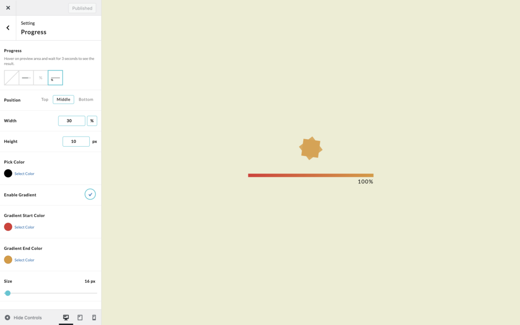
- Bar + Number – Display an animated loading bar and a counting number. (New since v1.1.0)
When choose None, then options below will be disabled and turn to grey. You don’t need to do any further actions to it.
Progress Bar
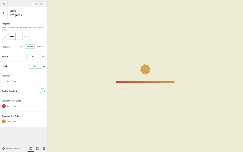
When choose Bar:
- Position – Top/Middle/Bottom.
- When choose Top or Bottom, the loading bar will be put at the top or the bottom of the browser window.
- When choose Middle, if there is also a loading animation, the bar will be put below the animation. If no animation, the bar will be right in the middle of the browser window.
- Width – Give a width value of the loading bar. You can click on the unit to switch between px and %.
- Height – Give a height value of the loading bar. The unit is px.
- Color – Click to choose a color from the color picker. Or enter the hex value of a color you like.
- Gradient Color – Since version 2.3.2, you can use gradient color as the background color of the progress bar. Just click to Enable Gradient, then pick a Start Color and an End Color. Currently we only support linear gradient between 2 colors.

Percentage
When choose Percentage:
- Position – Middle/Below Loader/Absolute Position. The “Middle/Below Loader” position is relevant to the loader. If there is no loader, the percentage will be right in the middle of the browser window.
- When choosing Middle, the percentage number will be put at the same place of the loader, which means they are overlapped. Then you can set Layer to decide which one will be put on top of the other.
- When choosing Below Loader, the percentage number will show below the loader.
- When choosing Absolute Position, 6 preset selectable absolute position options will show: Top Center/Top Left/Top Right/Bottom Center/Bottom Left/Bottom Right. You can choose one of them. New feature added in version 2.5.
- Margin – Add top/right/bottom/left margin to the percentage indicator. New feature added in version 2.5.
- Layer – When choose Middle as position, this option will show. Choose Front to bring the percentage number to the front layer of the loader. Choose Back, the percentage will be put behind the loader.
- Size – Drag to change font size.
- Color – Click to choose a text color from the color picker. Or enter the hex value of a color you like.
- Font – Choose a Google font, or use the website default font (so that LoftLoader Pro won’t call Google Fonts again). (New option added since v1.2.2)
- Google Font – Choose a font family from the Google Fonts list.
Or choose “Default” to use the font which is using by your site (so LoftLoader Pro won’t call Google Fonts again).(Updated since v1.2.2.) - Font Weight – Select font weight. Please note: not every font supports all the font weight values listed.
- Letter Spacing – Choose a letter spacing value in the list. It will expand or condense the space evenly between the characters.
Bar + Number
When choose Bar + Number:
- Position – Top/Middle/Bottom.
- When choose Top or Bottom, the loading bar will be put at the top or the bottom of the browser window.
- When choose Middle, if there is also a loading animation, the bar will be put below the animation. If no animation, the bar will be right in the middle of the browser window.
- Width – Give a width value of the loading bar. You can click on the unit to switch between px and %.
- Height – Give a height value of the loading bar. The unit is px.
- Color – Click to choose a text color from the color picker. Or enter the hex value of a color you like.
- Gradient Color – Since version 2.3.2, you can use gradient color as the background color of the progress bar. Just click to Enable Gradient, then pick a Start Color and an End Color. Currently we only support linear gradient between 2 colors. Please note that the gradient color will be applied to the progress bar only, and the color of the percentage number will still be the solid color.
- Size – Drag to change font size for the progress count number.
- Font – Choose a Google font, or use the website default font (so that LoftLoader Pro won’t call Google Fonts again). (New option added since v1.2.2)
- Google Font – Choose a font family from the Google Fonts list.
Or choose “Default” to use the font which is using by your site (so LoftLoader Pro won’t call Google Fonts again).(Updated since v1.2.2.) - Font Weight – Select font weight. Please note: not every font supports all the font weight values listed.
- Letter Spacing – Choose a letter spacing value in the list. It will expand or condense the space evenly between the characters.

