Loader
Loader General Options
Click on the Loader section, then you can choose a loader animation and tweak its style.
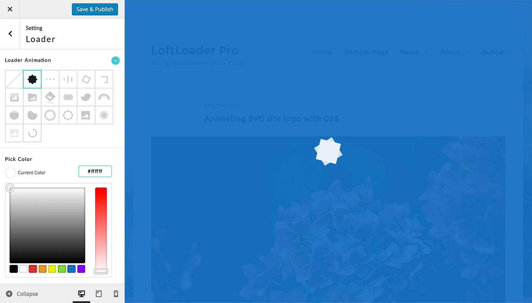
- Loader Animation – We provide 19 types of animations. 6 support custom images. And all animations are created with CSS3, not GIF. So it can be set to any color. You can also disable the loader, and only show progress bar or counting percentage (see in Progress).
- Loader Color – Click to choose a color from the color picker. Or enter the hex value of a color you like. Please note: some animations support multiple colors.
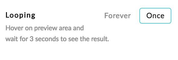
- Looping – All animations are looping forever by default. Some support Loop Once. When you select an animation supporting Loop Once, this option will show. If choose Loop Once, the animation will play along with the loading progress, and end when preloading is completed.
Loader Animations that Support Loop Once
So far there are 5 types of Loader Animations that support Loop Once effect:
- Custom Image Loading
- Rainbow
- Circle Filling
- Water Filling
- Petals
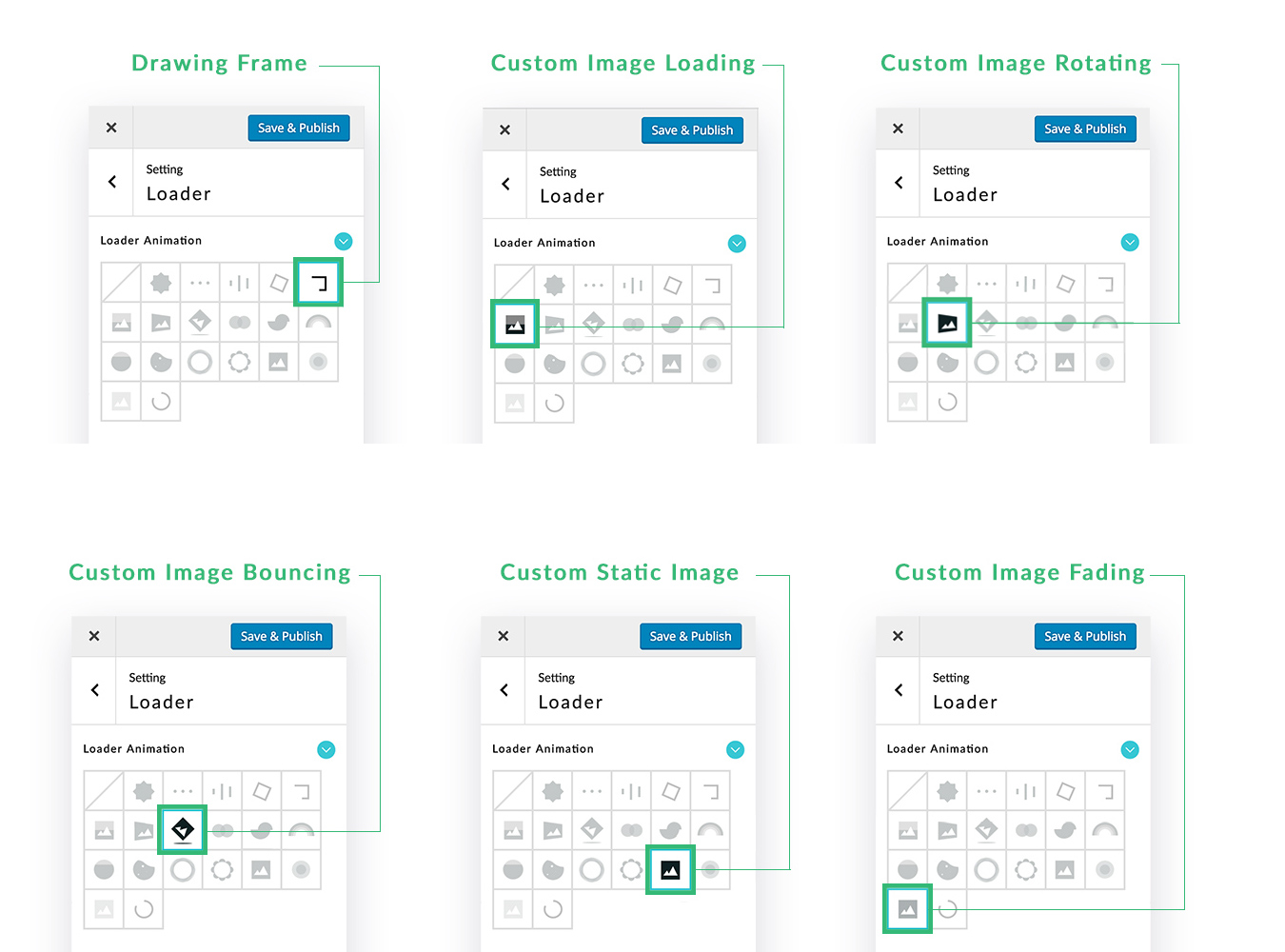
Add Custom Image
When choose one of these 6 animations, you can upload a custom brand image:
- Drawing Frame
- Custom Image Loading
- Custom Image Rotating
- Custom Image Bouncing
- Custom Static Image
- Custom Image Fading (New since v1.1.0)
Then you will see the options below:
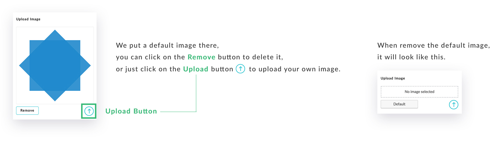
- Upload Image – Click on the Upload button to add a custom image, for example, the site logo.
- Image Width – To keep your custom image look sharp on retina devices, we recommend upload an image with 2x size and give 1x size. For example, upload an image which is 200 x 200 px, and enter 100 px as the image width value. Please note: If you choose Drawing Frame, then this option is not available because the custom image size will be set to 20% smaller than the frame automatically.
- Max Width for Responsive Design – You can set the maximum width of the custom image width by changing this option. For example, you set the Image Width of the custom image to 800 pixels, and when the browser width is 800 pixels or more, the image’s width will be 800 pixels. When the browser screen width is less than 800 pixels, the image will take up the full width of the screen without any left or right space. If you’d like to leave some space around the image on a smaller screen, you can set the max width value to less than 100%, such as 80%. Then this custom image will only take up 80% of browser width at the most. You can find more details here.
- Direction – When choose Custom Image Loading or Custom Image Rotating, this option will show.
- Custom Image Loading – You can choose loading the image horizontally or vertically.
- Custom Image Rotating – The image can be rotated in 2D or 3D space.
- Also Rolling – When choose Custom Image Bouncing, this option will show. Check it then your image will be also rolling while bouncing.
Loader - Drawing Frame
We have added the 3 options below for Loader – Drawing Frame since v1.0.5.
- Frame Width – Enter a number to change the frame width.
- Frame Height – Enter a number to change the frame height.
- Frame Border – Here you can adjust the border width of the frame.
Loader - Custom Image Rotating
We have added the option below for Loader – Custom Image Rotating since v1.0.5.
- Speed Curve – Linear or Ease Out & Back. When choose Linear, the custom image will rotate at the same speed. When choose Ease Out & Back, the custom image will rotate fast at start and get slower, then will rotate a little bit back and start again.
And We have added the option below for Loader – Custom Image Rotating > Direction 2D since v1.1.8.
- Rotation – Clockwise or Counterclockwise.
Custom HTML Loader
This is a new feature added in version 2.2.2.
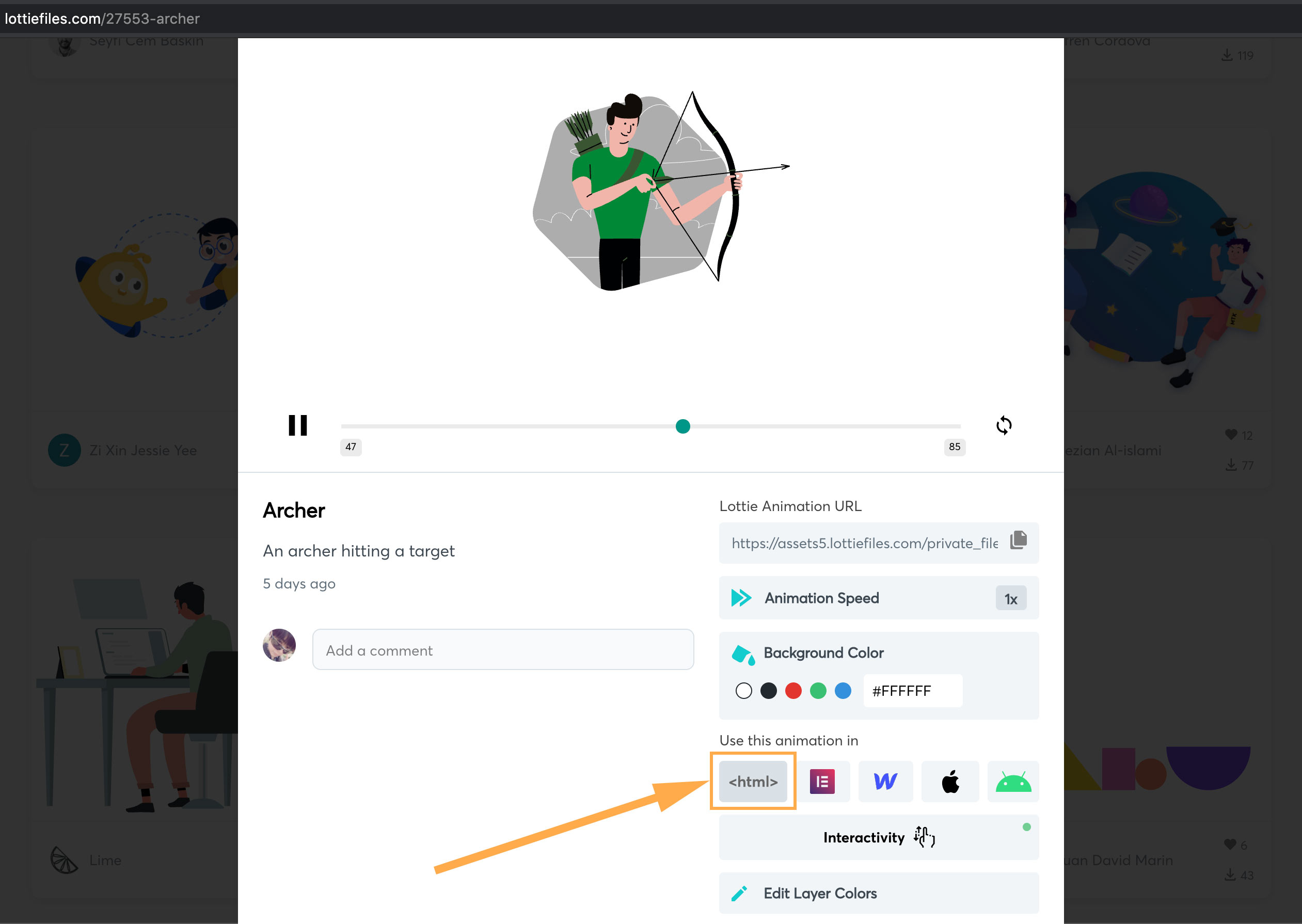
When selecting Custom HTML Loader, you will be able to add the HTML code of your custom loader animation. For example, you can add a pre-defined SVG animation from LottieFiles.
You can find a SVG animation on LottieFiles, click it to popup a window of its details. Find the “Use this animation in” option, and click “< html >“.
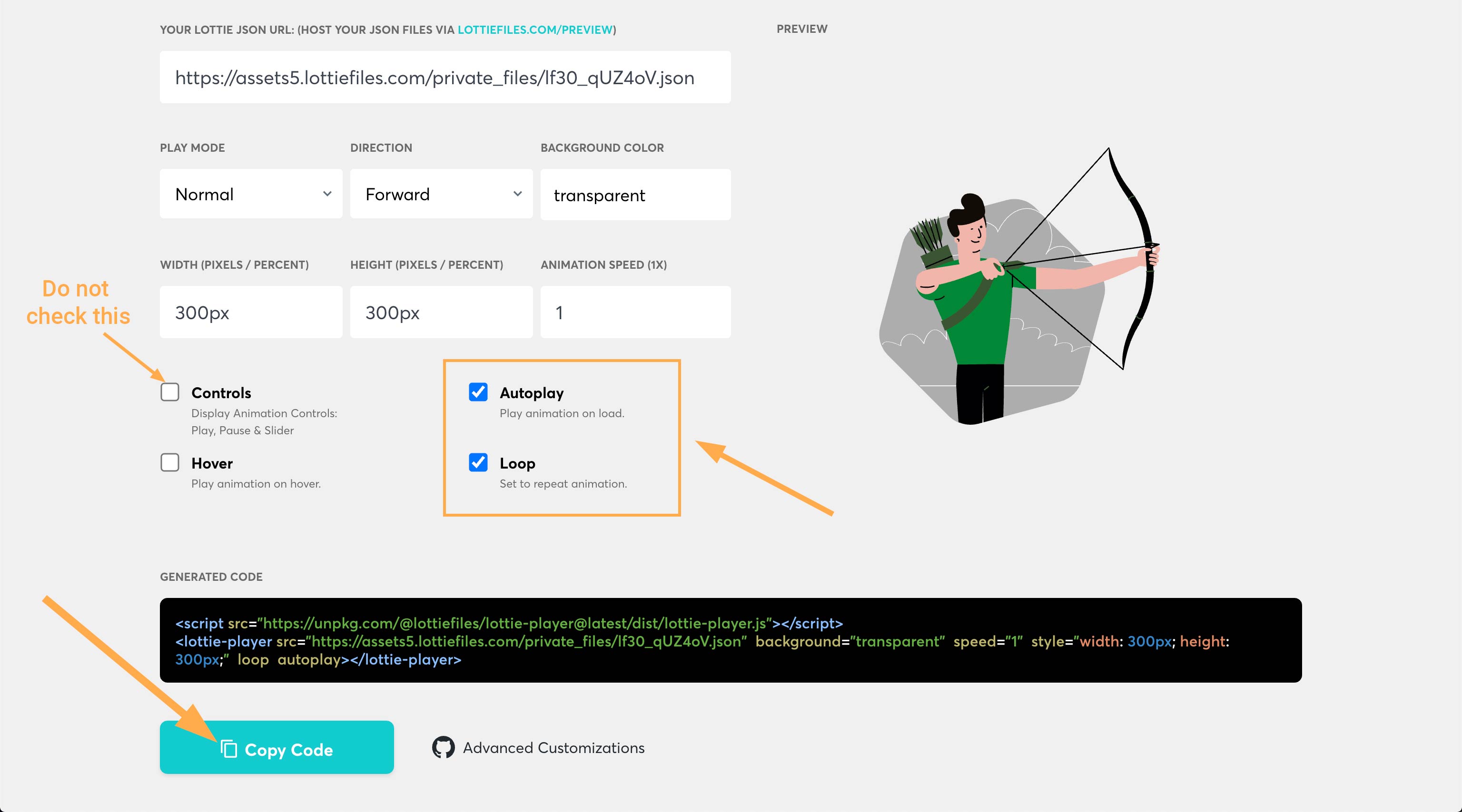
You can adjust some settings for the animation, and click “Copy Code“.
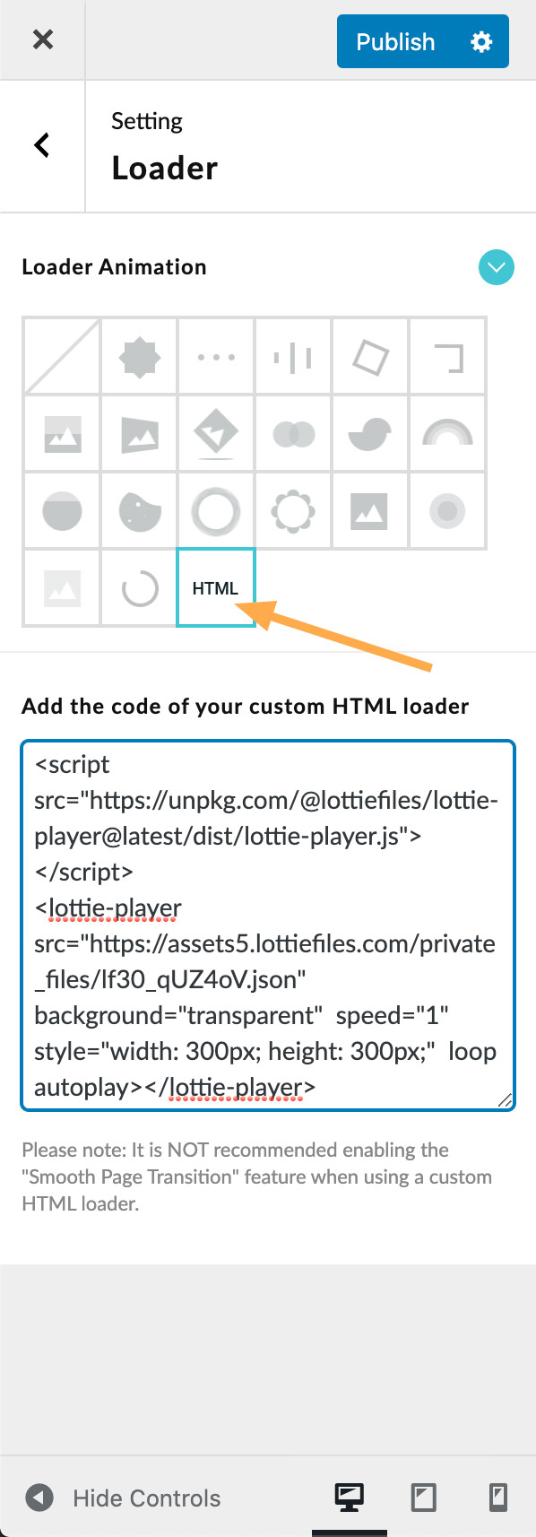
Then please open the setting panel of LoftLoader Pro, navigate to “Loader” > select “Custom HTML Loader“, and paste the code into the box.
Please note: It is NOT recommended enabling the “Smooth Page Transition” feature when using a custom HTML loader. Because the loader may need to re-render every time the page is opened or refreshed, the loader animation may disappear for a while before reappearing during the page transition process. And it is controlled by the third-party animation library you use, which we cannot control.
More Options for Specific Animations
And more. Some options only show and work for one type of animation. And you can always play with the options and see the result in the preview area instantly.
Max Width for Responsive Design
When you choose one of the following Loader Animations for your preloader, you will see the “Max Width for Responsive Design” option.
- Custom Image Loading
- Custom Image Rotating
- Custom Image Bouncing
- Custom Static Image
- Custom Image Fading
By changing the value of this option, you can set the maximum width of the custom image width.
For example, you set the Image Width of the custom image to 800 pixels, and when the browser width is 800 pixels or more, the image’s width will be 800 pixels. When the browser screen width is less than 800 pixels, the image will take up the full width of the screen without any left or right space. If you’d like to leave some space around the image on a smaller screen, you can set the max width value to less than 100%, such as 80%. Then this custom image will only take up 80% of browser width at the most.
Let’s explain this setting with an example:
On desktop devices, we’d like to limit the logo image width to 280px.
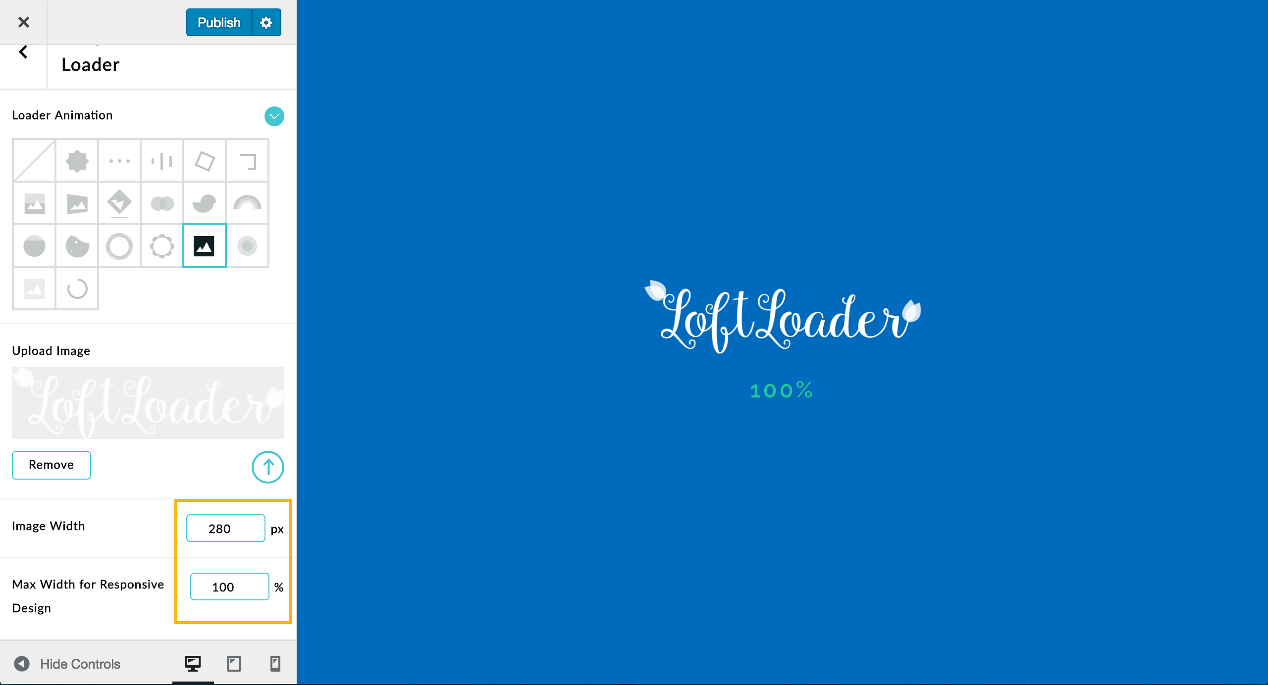
Then click on the “Device Preview – Mobile” button to switch to the preview for phone-sized devices:
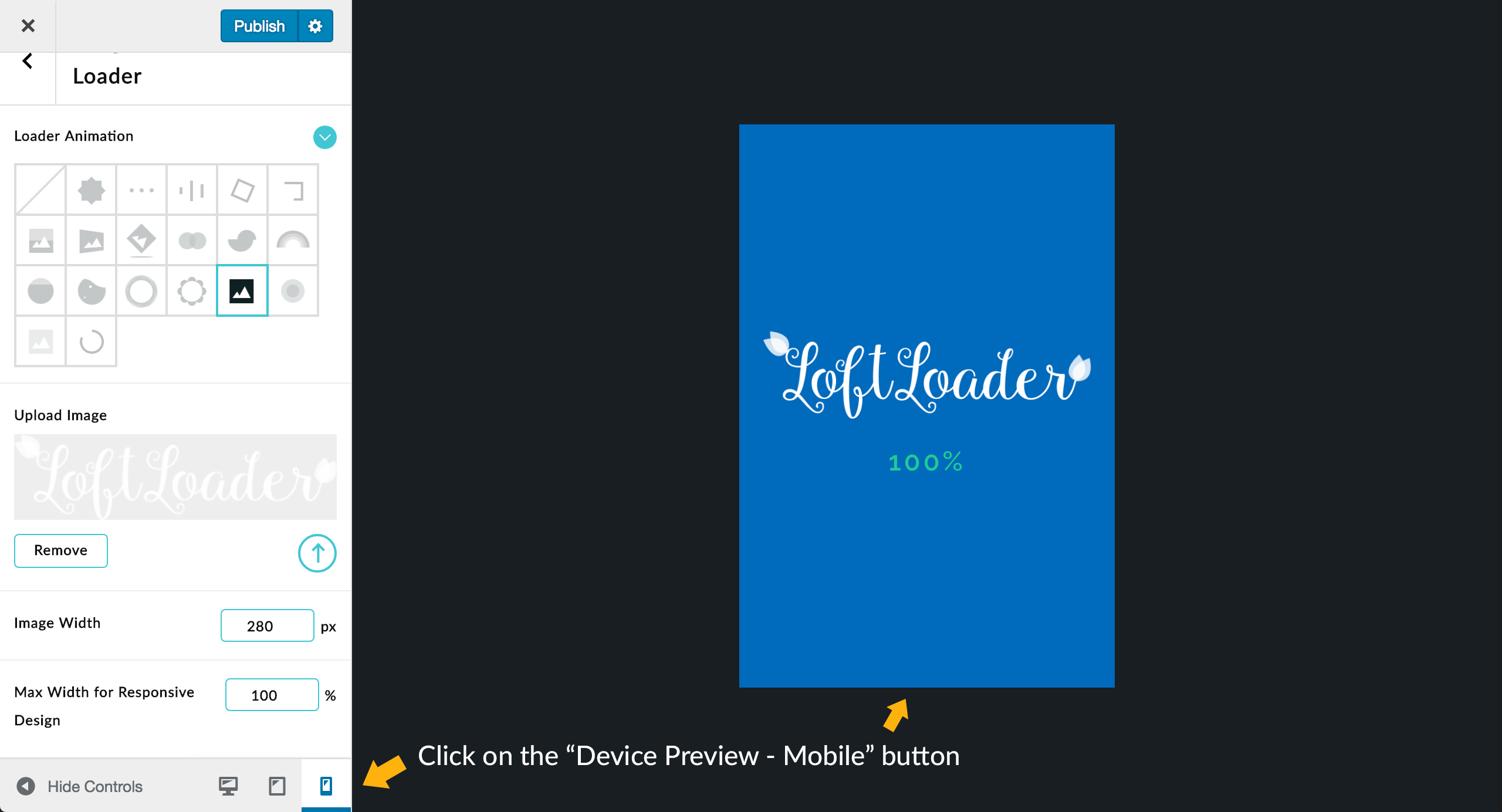
Since the value of “Max Width for Responsive Design” is “100%”, which means that the maximum width of the logo image can be 100% of the screen width. As the Device Preview Size of the mobile version is set to 320px x 480px, the logo image width on mobile devices is still 280px.
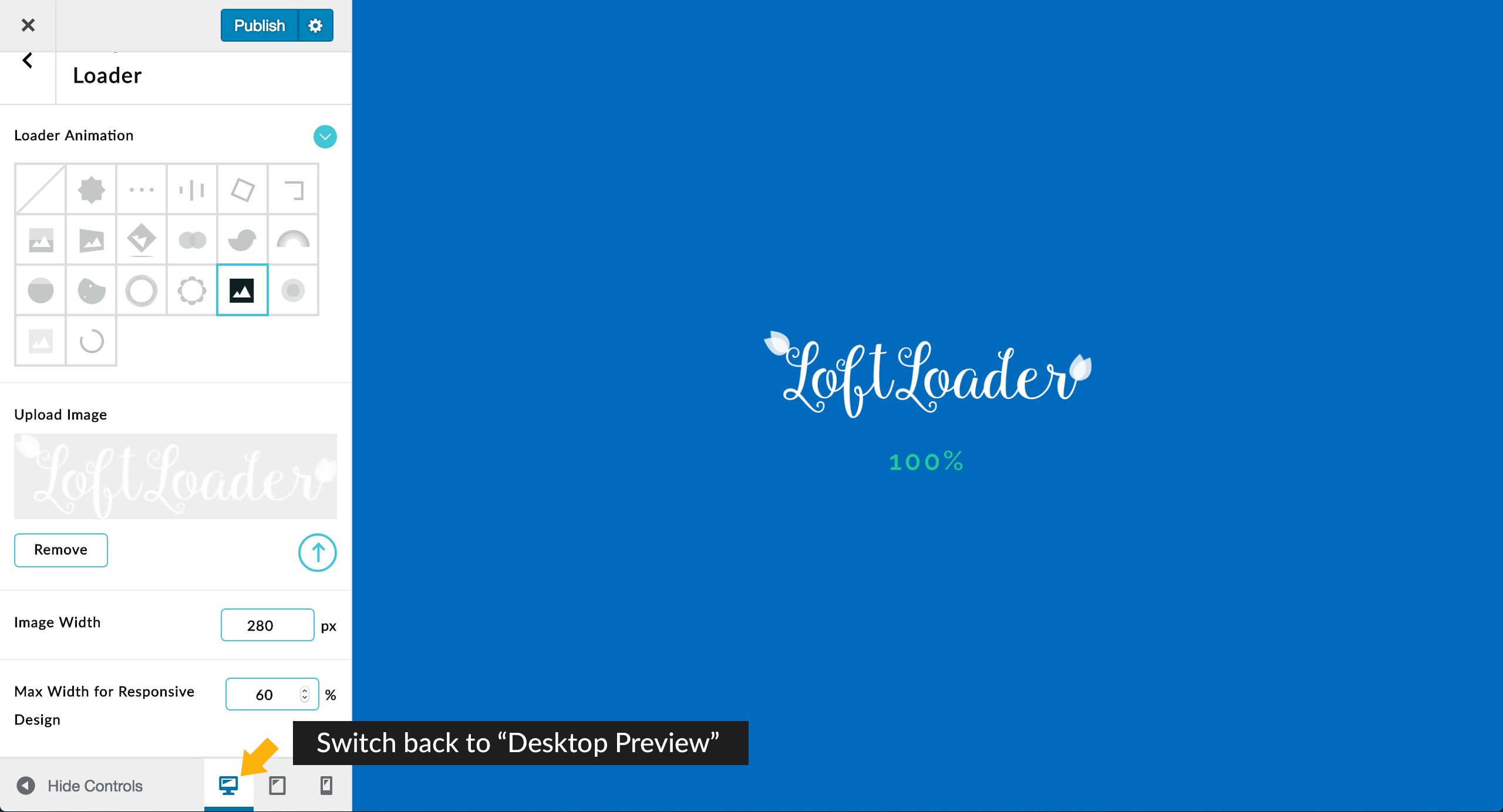
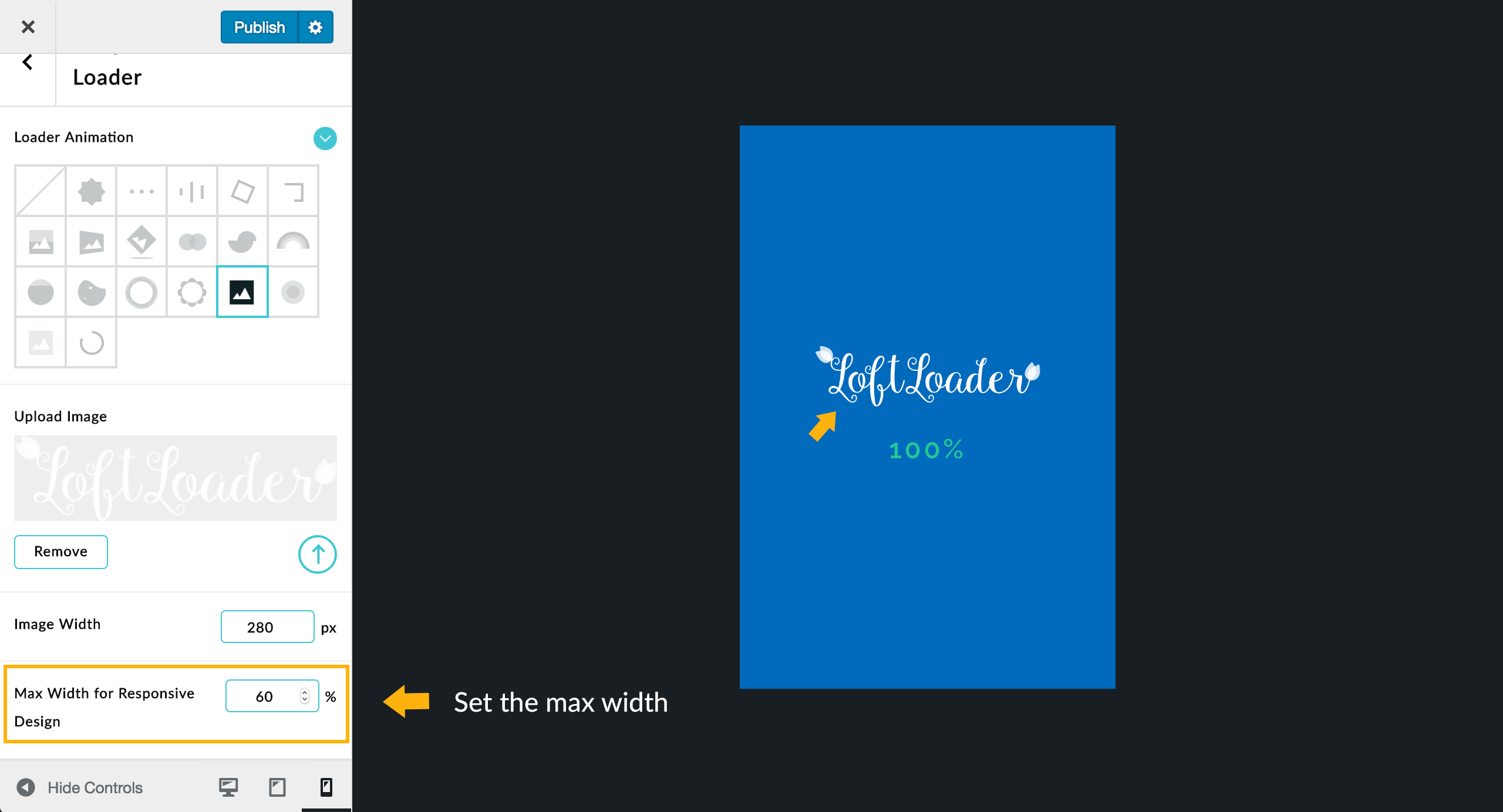
If you’d like to make the logo image smaller on mobile devices, you can reduce the “Max Width for Responsive Design” value, for example, change it to “60%”. Then the logo will look like this in the preview area:
Then you can switch back to “Desktop Preview“. Usually the desktop devices have a screen resolution of 1024×768 pixels or higher (Screen Resolution Statistics), the maximum width of the logo image is at least: 1024 x 0.6 = 614.4 pixels. It is greater than the “Image Width” value we set (280px), so the logo image width on desktop devices is still 280px.