FAQ
Height on Mobile Devices
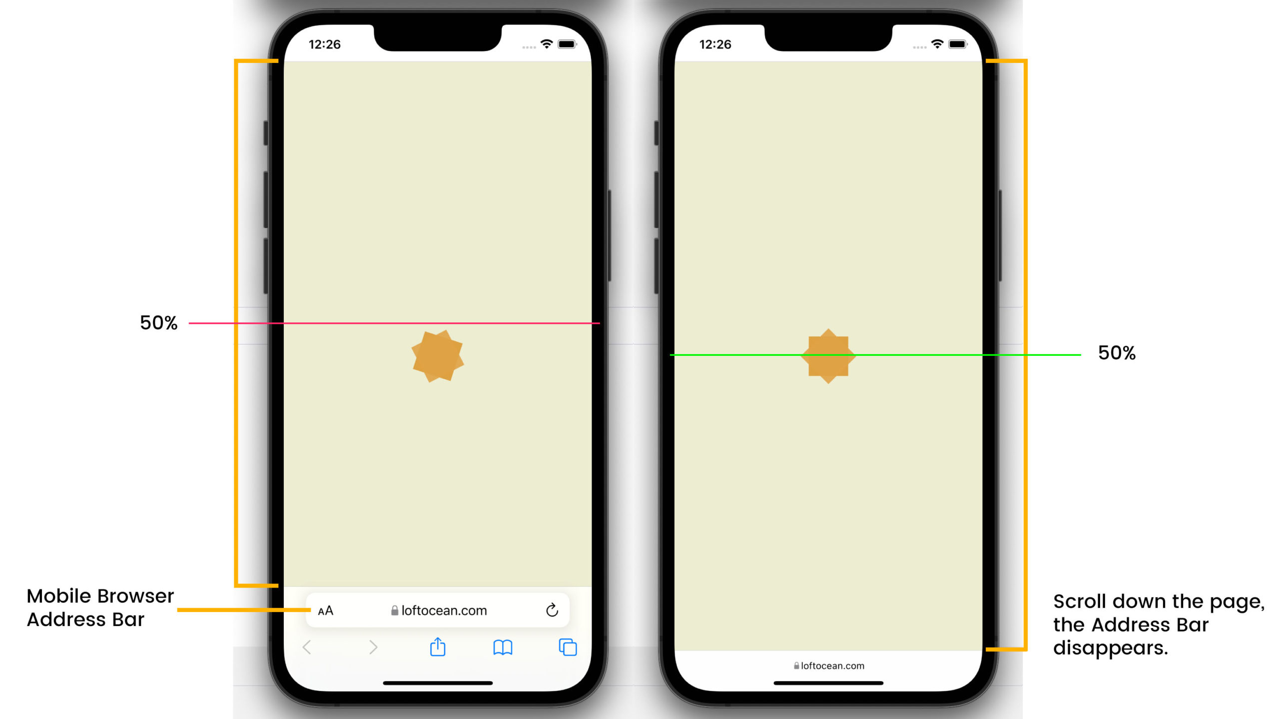
When you check on a mobile phone, you may find that the loader (and other elements such as message) is not vertically centered in the screen when the browser’s address bar/toolbar is displayed. Then, if you scroll down the page and you will see that the address bar/toolbar disappears and then the loader is vertically centered. As shown in the screenshot below:

This is because the default loading screen height is set to 100% of the viewport height. The viewport is the visible area of the device (the toolbar is also in the viewport), so the height of the viewport is fixed.
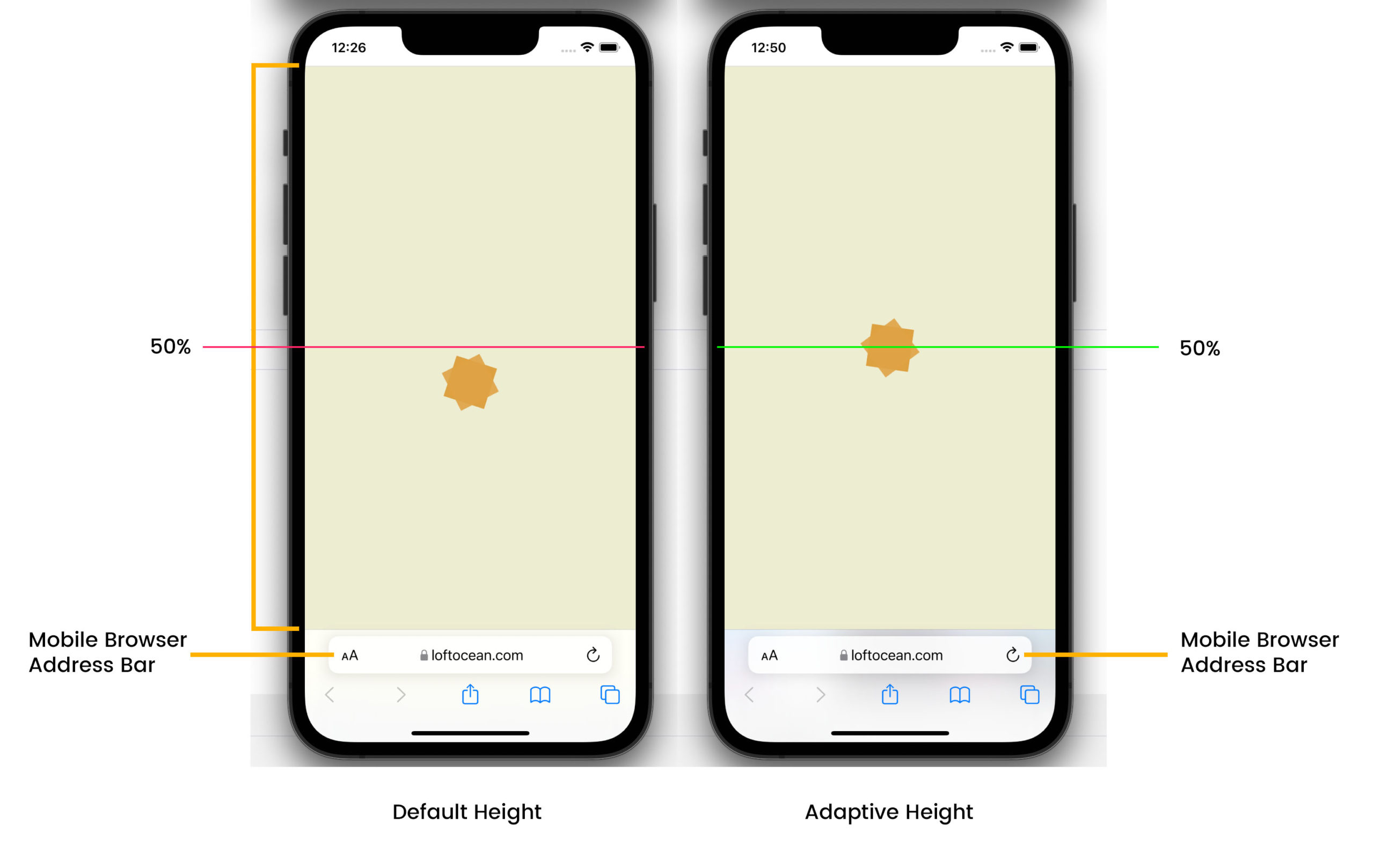
In LoftLoader Pro v2.3.2, we added a new option: LoftLoader Pro Settings > More > Height on Mobile > Adaptive Screen Height for Mobile Devices. When this option is enabled, the height of the loading screen will be adaptive, which means that when the address bar/toolbar of the browser appears, the height of the loading screen will become: the viewport height – the height of the toolbar. And the loader is vertically centered (see the right side of the screenshow below.)

However, please note: If you enable the Adaptive Height option, the height of the screen will change depending on whether the address bar is displayed or not, which will cause the position of the loader to also change. You may see that the loader moves up or down slightly, especially when you activate the Smooth Page Transition feature.
Therefore, enabling or not enabling the Adaptive Height option has its advantages and disadvantages. We provide this option to users, and you can decide whether to enable this option based on your website situation and personal preferences.
