Modules
How to Add a Module
- Open LoftBuilder editor screen, activate content edit mode.
- Click on Modules button in the main toolbar.
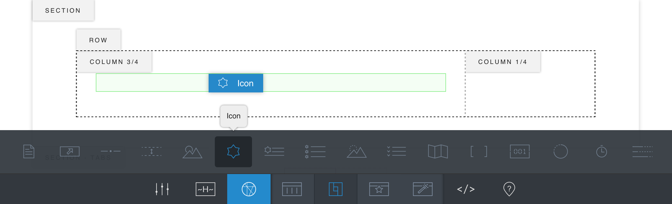
- You can find all modules show in the sub toolbar. Select one, hold to drag it onto your page and drop it at the target place. A green box will show when it’s droppable.
- The module now appears on the page.
Currently we provide 16 modules in all. We will go through the modules one by one in the following subsections.
How to Edit a Module
When the page’s content edit mode is on, move your cursor on to a module, the module’s toolbar will show.
Module Toolbar
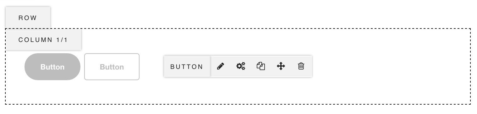
- Edit – Click it to activate the Module Edit Mode and show its Module Editing Tools, then you can edit the module content and style it. Each module has specified Module Editing Tools.
- Advanced Settings – Click it open the Module Advanced Settings panel. Read Module Advanced Settings subsection for more details.
- Clone – Click to add a copy of the module after the original one.
- Move – Hold it to drag the module to other places.
- Delete – Click it to remove the module.
Module Edit Mode
When click on the (Edit) button in a module toolbar, it activates the Edit Mode of this module. Then there will appear some tools for you to manage the module’s content and styles, which we call them Module Editing Tools.
Each module has specified Module Editing Tools.
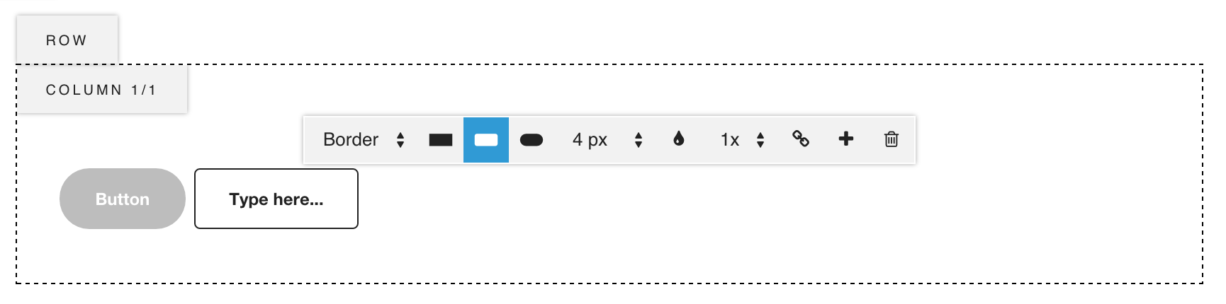
The module editing tools of Button module.
How to quit Module Edit Mode
Click on anywhere outside of the module to exit the Module Edit Mode.
Module Advanced Settings
When click the (Advanced Settings) button in a module toolbar, it opens the Module Advanced Settings panel. There are 2 options:
- Module Custom Class – You are able to add a custom class name to the module. So later you can write custom css for it.
- Enable Absolute Position – Enable to set this module’s position to “absolute” in the column. Then choose to force the module sticky to the column’s top or bottom.
Text
Text Module allows you to add any text elements to the page, such as headings, text blocks, lists and etc.
Editing a Text Module
- Move your cursor onto the text module to show the Module Toolbar, click the (Edit) button.
- The Text Editing Tools show as below:
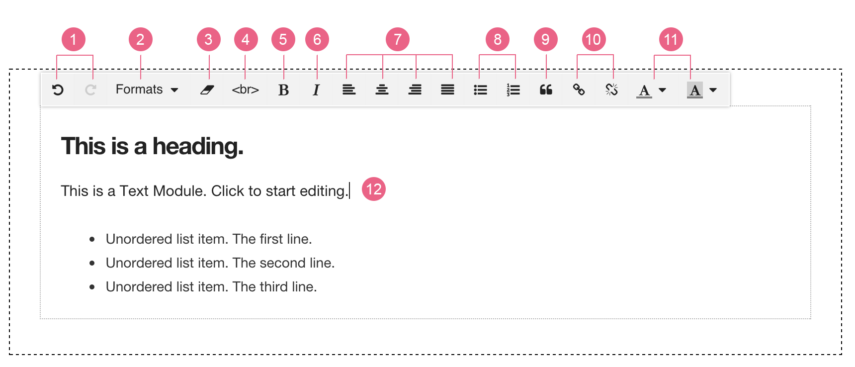
- Undo & Redo
- Formats
- Clear Formatting
- Line Break
- Bold
- Italic
- Alignments
- List
- Blockquote
- Link & Unlink
- Color & Background Color
- Type Content
- Click on anywhere outside of the module to exit the Module Edit Mode.
- You can turn off the Content Edit Mode to see the page preview.
Button
When you add a button, it inherits the default button style you have set in Plugin Settings, We have talked about how to set up the default type of all buttons in this chapter. You can always change a button’s styles when editing it.
You can add multiple buttons as a group in one button module, and each button in the group can have different styles.
Editing a Button Module
- Move your cursor onto the button module to show the Module Toolbar, click the (Edit) button.
- The first button in the group now is highlighted, which means you are editing this one. To edit another button in the group, just click on that button to switch on its editing mode. And you can see the Button Editing Tools:
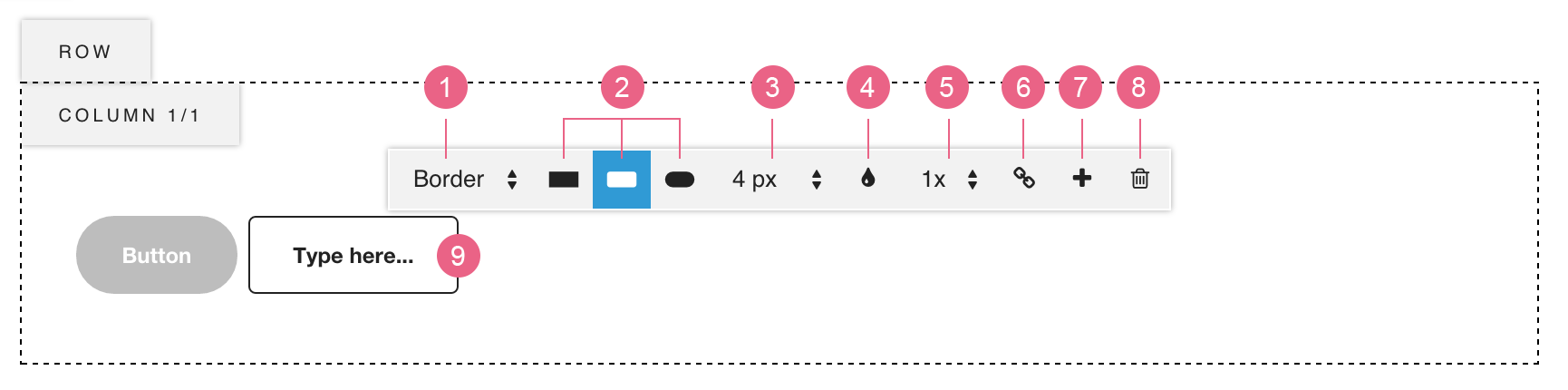
- Button Style – Solid / Border.
- Button Shape – Rectangle / Rounded Corner / Pill. Click to select one.
- Rounded Corner Size – Set the corner size when you choose Rounded Corner shape.
- Button Color – Click the open the color picker.
- Button Size – Choose from 3 sizes.
- Button Link – Edit link url of this button.
- Add Button – Click to add another button after the current one.
- Remove Button – Click to remove the current button.
- Button Text – Click on the button and type the button text.
- Click on anywhere outside of the module to exit the Module Edit Mode.
- You can turn off the Content Edit Mode to see the page preview.
Separator
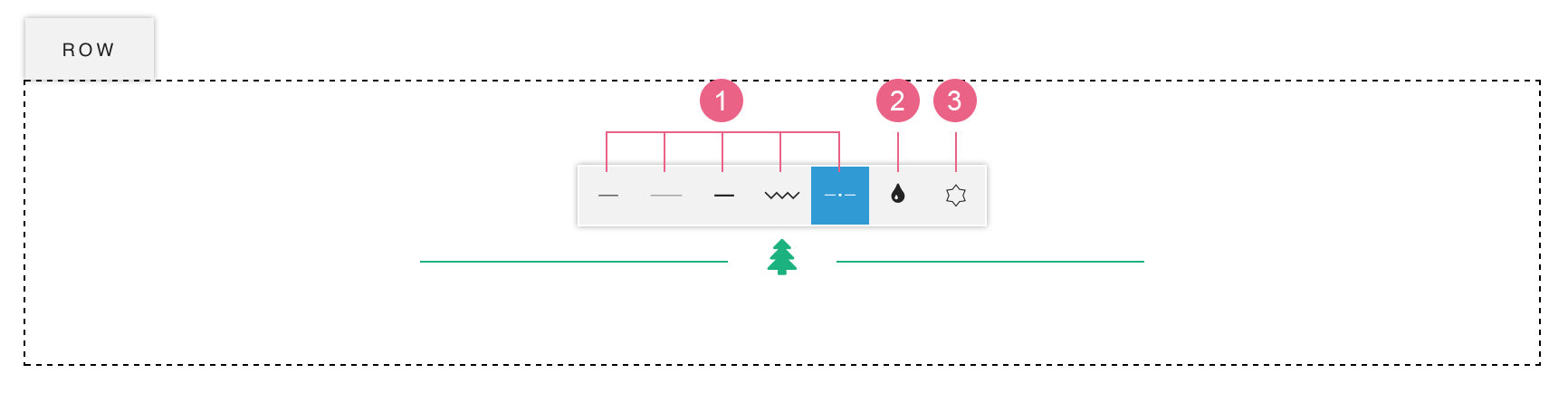
Separator allows you to add a styled separator line to the page. We have talked about how to set up the default type of all separators in this chapter. Here are 5 separators:
- Thin & Short
- Thin & Long
- Bold & Short
- Zigzag
- With Icon
If you choose Bold & Short as the default separator type in Plugin Settings, then when you add a separator, it will be Bold & Short, but you can always choose another type when editing it.
Editing a Separator
- Move your cursor onto the separator to show its Module Toolbar, click the (Edit) button.
- Now you can see the Separator Editing Tools:
- Separator Types – Click to select one.
- Separator Color – Click the open the color picker.
- Select Icon (when you choose With Icon type) – Click to open the icons panel.
- Click on anywhere outside of the module to exit the Module Edit Mode.
- You can turn off the Content Edit Mode to see the page preview.
Space
You can add an empty space between modules to increase the vertical distance between them. Here are 3 different height of Space Module: Small, Medium & Large.
Editing a Space Module
- Move your cursor onto the space module, background pattern will appear to let you know how much space it takes. And the Module Toolbar shows too, click the (Edit) button.
- Now you can see the Space Editing Tools, there are only 3 buttons which represent the 3 sizes of space. Click to select one.
- Click on anywhere outside of the module to exit the Module Edit Mode.
- You can turn off the Content Edit Mode to see the page preview.
Media
You need to work with Media module when you are adding a single media file like graphic/video/audio to your site. It allows you to upload a new media file or select one from the media library.
Editing a Media Module
- Move your cursor onto the media module to show the Module Toolbar, click the (Edit) button.
- It opens the WordPress Media Library panel. You can upload a media file from your computer, or select one from the library, then close the panel.
- Click on anywhere outside of the module to exit the Module Edit Mode.
- You can turn off the Content Edit Mode to see the page preview.
Icon
Icon Module allows you to add FontAwesome Icons to your site pages. The FontAwesome Icons are font-based icons, which can be scaled without any quality/detail loss.
You can add multiple icons as a group in one icon module, and each icon in the group can have different styles.
Editing an Icon Module
- Move your cursor onto the icon module to show the Module Toolbar, click the (Edit) button.
- The first icon in the group now is highlighted, which means you are editing this one. To edit another icon in the group, just click on that icon to switch on its editing mode. And you can see the Icon Editing Tools:
- Choose Icon – Click to open icons panel, click one to select and close the panel.
- Icon Style – With Border / With Background / Icon Only. Click one to select.
- Icon Color – Click the open the color picker.
- Icon Size – Choose from 5 sizes.
- Icon Link / Unlink – Add link url to this icon or remove the link.
- Add Icon – Click to add another icon after the current one.
- Remove Icon – Click to remove the current icon.
- Click on anywhere outside of the module to exit the Module Edit Mode.
- You can turn off the Content Edit Mode to see the page preview.
Icon with Text
Icon with Text module allows you to create a text block starting with an icon.
Editing an Icon With Text Module
- Move your cursor onto the Icon With Text module to show the Module Toolbar, click the (Edit) button.
- Now you can see the Icon With Text Editing Tools:
- Choose Icon – Click to open icons panel, click one to select and close the panel.
- Icon Style – With Border / With Background / Icon Only. Click one to select.
- Color – Choose any color from a color picker.
- Icon Size – Choose one from 5 sizes.
- Text Format – Select text tag: < h1 >, < h2 >, < p >…
- Edit Text – Click and type the text content.
- Click on anywhere outside of the module to exit the Module Edit Mode.
- You can turn off the Content Edit Mode to see the page preview.
Icon List
Icon List module allows you to create a list group with each list starting with an icon.
Editing an Icon List Module
- Move your cursor onto the Icon List module to show the Module Toolbar, click the (Edit) button.
- Now you can see the Icon List Editing Tools:
- Choose Icon – Click to open icons panel, click one to select and close the panel.
- Icon Color – Click to open the color picker and choose a color for all icons.
- List Text Size – Choose from 3 sizes: small / medium / large.
- Edit Text – Click and type the text content.
- Hover on one list item to show the Item Toolbar which contains 2 buttons:
- Add New – Click to add a new list item after the current one.
- Remove – Click to remove the current list item.
- Click on anywhere outside of the module to exit the Module Edit Mode.
- You can turn off the Content Edit Mode to see the page preview.
Graphic Reveal
Graphic Reveal module helps you to create an interactive animation which shows an image on top of the other with a fading in effect while hovering on the module.
Editing a Graphic Reveal Module
- Move your cursor onto the graphic reveal module to show the Module Toolbar, click the (Edit) button.
- Now you can see the Graphic Reveal Editing Tools:
- Edit Bottom – Upload / select an image that is at bottom, it will always show.
- Edit Top – Upload / select an image that is on top, it will be hidden for normal state and show for hover state.
- Click on anywhere outside of the module to exit the Module Edit Mode.
- You can turn off the Content Edit Mode to see the page preview.
Accordion
Accordion module is often used for creating FAQ content.
Editing an Accordion Module
- Move your cursor onto the accordion module to show the Module Toolbar, click the (Edit) button.
- You can click on the Accordion Item Title and edit the content. And hover on the item to show the Accordion Item Toolbar on the top right corner of this item.
- Add New – Click to add a new accordion item after the current one.
- Remove – Click to remove the current accordion item.
- Click on the accordion item title also expands this item and show its Accordion Item Content. Click on the content, the text toolbar shows and you can edit the content text.
- Click on anywhere outside of the module to exit the Module Edit Mode.
- You can turn off the Content Edit Mode to see the page preview.
Map
Map module lets you add a google map to your site and style it. Before adding any Google Map to your pages, please read Get a key to use Google Maps on your website.
Editing a Map Module
- Move your cursor onto the map module to show the Module Toolbar, click the (Edit) button.
- It opens the Module – Map settings panel. The map options includes:
- Map Height – Custom Height / Screen Height.
- Address – Enter the address of the location you wish to show on map.
- Lat & Lng – To accurate the target location, you can use its latitude and longitude coordinates. Please keep reading to know how to get the coordinates.
- Map Color Style – It provides 4 different color styles.
- Custom Marker – Upload a custom marker image.
- You can turn off the Content Edit Mode to see the page preview.
How to get Lat and Lng of a place
To get the coordinates of a place, please:
- Click to view Search for & get coordinates on Google Map Help.
- Find Get the coordinates of a place. And find the coordinates by following those steps.
- You will find the Lat (latitude) and Lng (longitude) in the card:
Shortcode
Shortcode Module allows you to insert any shortcode of installed plugins.
Editing a Shortcode Module
- Move your cursor onto the shortcode module to show the Module Toolbar, click the (Edit) button.
- The editor panel will pop up. You can paste shortcodes in it and click on “Apply” button.
- Please note: shortcodes will not be parsed in the editor. Please save your page and go to frontend to check the result.
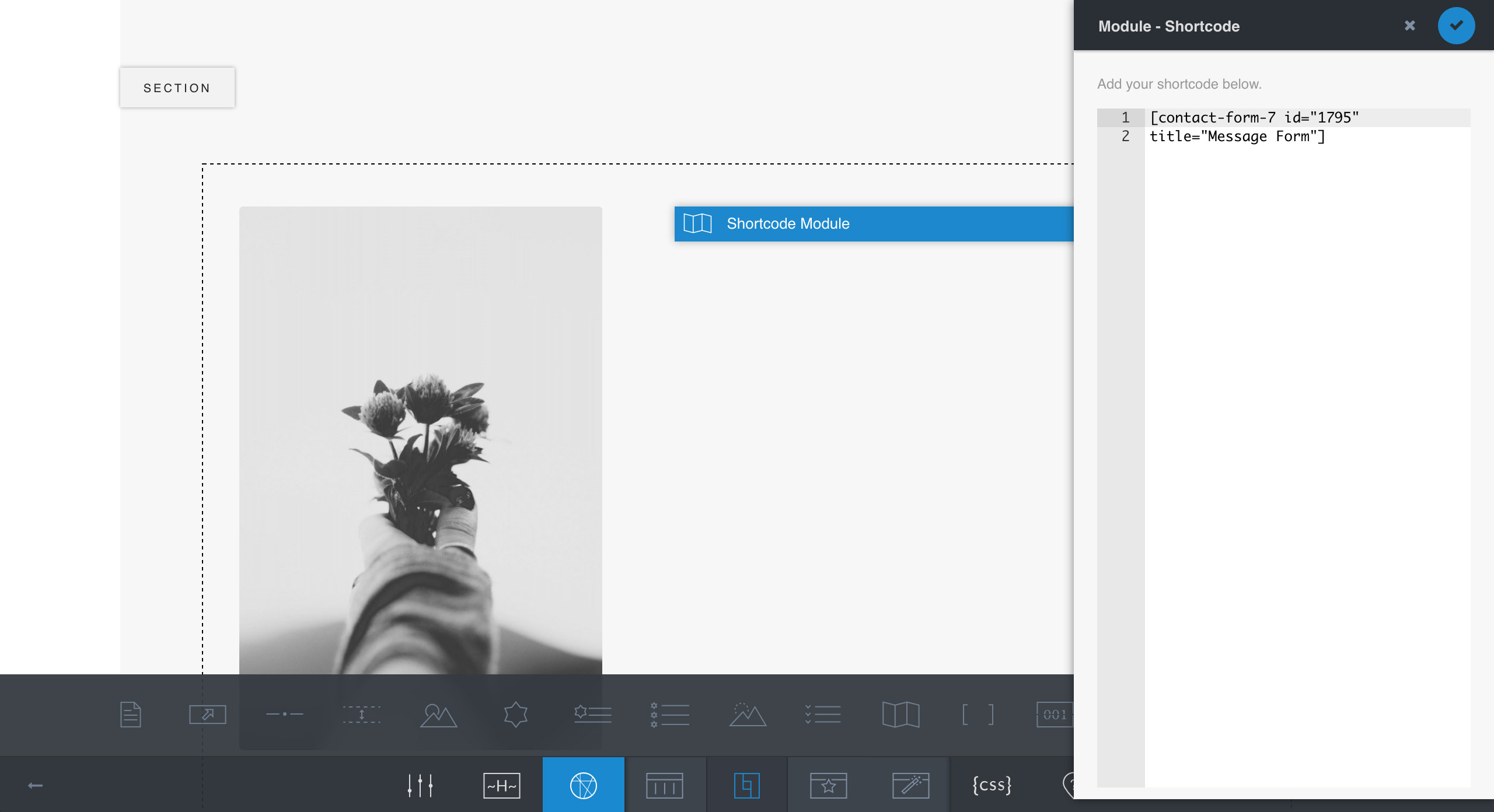
Paste the shortcode of a Contact Form 7 form into the shortcode editor panel
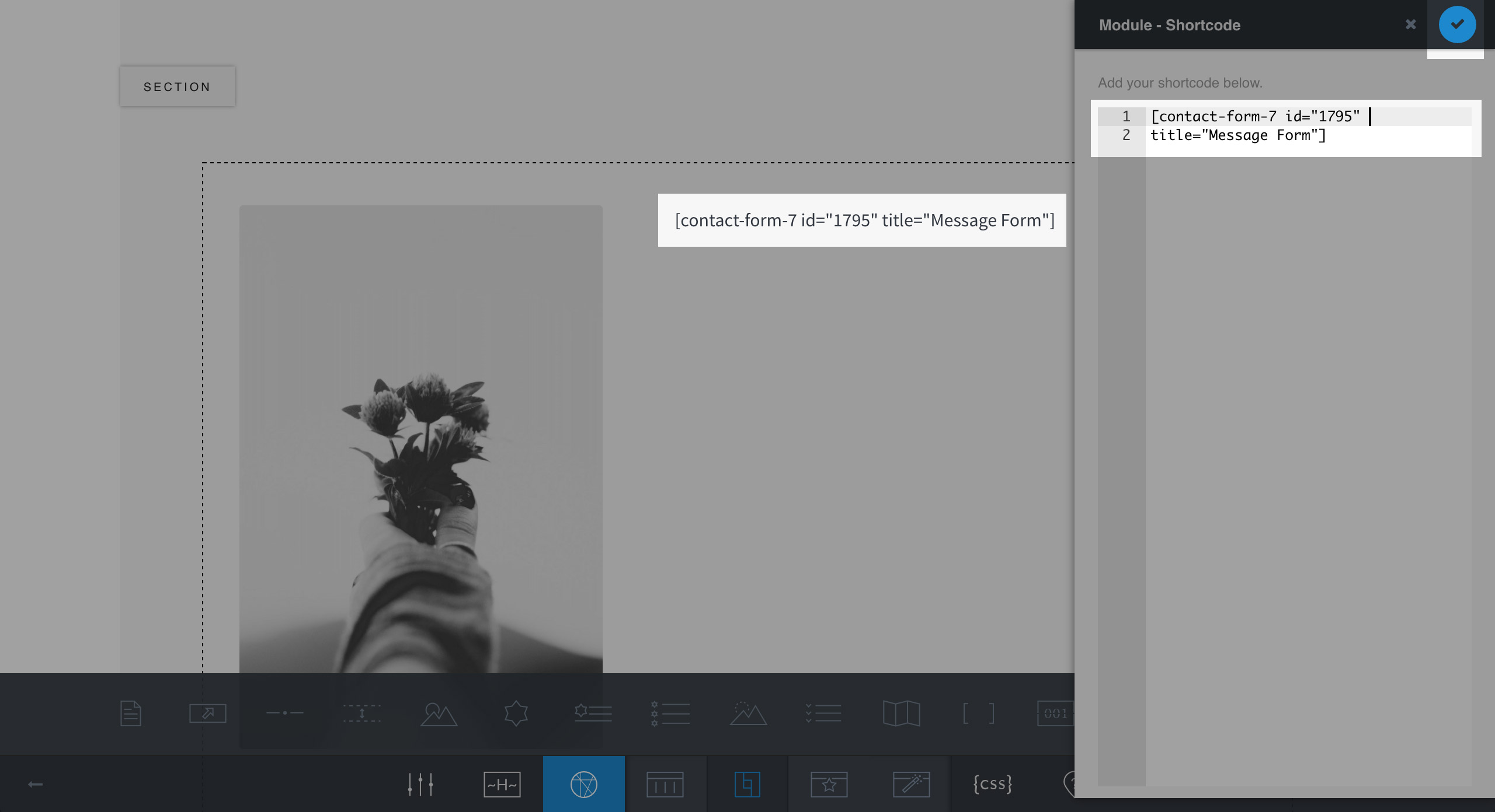
Click on the “Apply” button to update the shortcode to the page
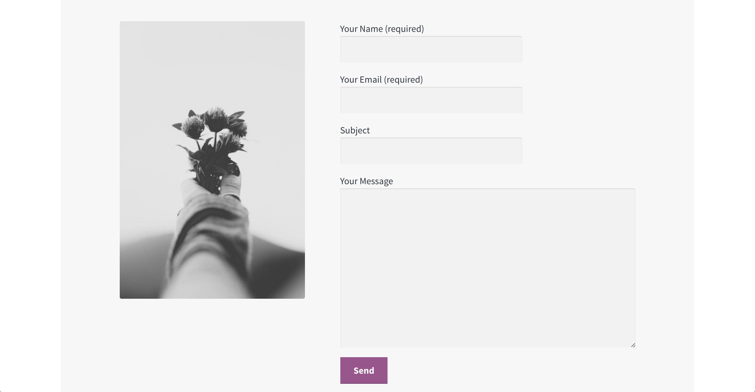
Contact Form 7 form on frontend
Data Counter
Data Counter module displays a group of data, and starts to count each data when they scroll into screen.
Editing a Data Counter Module
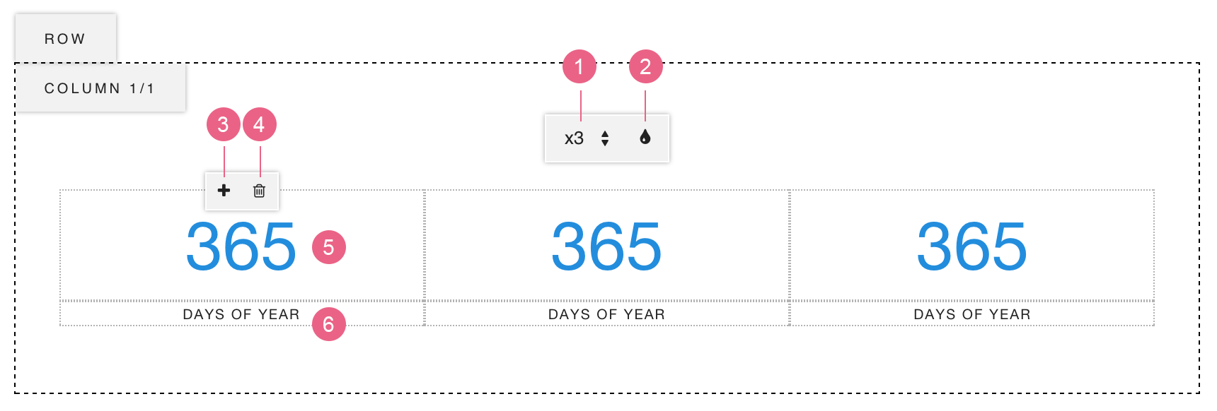
- Move your cursor onto the Data Counter module to show the Module Toolbar, click the (Edit) button.
- Now you can edit the module:
- Grid – Choose one from 1/2/3/4/5 columns.
- Data Color – Click to open the color picker and choose a color for all data text.
- Hover on each counter item to show the Item Toolbar. Add New – Click to add a new data counter item after the current one.
- Remove – Click to remove the current data counter item.
- Edit Data – Click and type the data number.
- Edit Title – Click and type the title.
- Click on anywhere outside of the module to exit the Module Edit Mode.
- You can turn off the Content Edit Mode to see the page preview.
Circle Counter
Circle Counter module displays a group of circles which represents different data, and starts to draw each circle when they scroll into screen.
Editing a Circle Counter Module
- Move your cursor onto the Circle Counter module to show the Module Toolbar, click the (Edit) button.
- Now you can see the Circle Counter Editing Tools:
- Grid – Choose one from 1/2/3/4/5 columns.
- Font Size – Normal / Large.
- Edit Text – Click and type the text.
- Hover on one counter item to show the Item Toolbar:
- Circle Fill – Set the percentage of the circle’s fill.
- Color – Click to open the color picker and select one color for this item only.
- Add Icon – Click to open the icons panel, choose one to place it in front of text.
- Remove Icon – Click to remove the icon.
- Add New – Click to add a new circle counter item after the current one.
- Remove – Click to remove the current circle counter item.
- Click on anywhere outside of the module to exit the Module Edit Mode.
- You can turn off the Content Edit Mode to see the page preview.
Time Counter
Time Counter module allows you to create a countdown timer to any date.
Editing a Time Counter Module
- Move your cursor onto the Time Counter module to show the Module Toolbar, click the (Edit) button.
- Now you can see the Time Counter Editing Tools:
- Set Target Time – Select the target date and time.
- Time Color – Click to open the color picker, select a color for the time.
- Font Size – Normal / Small.
- Click on anywhere outside of the module to exit the Module Edit Mode.
- You can turn off the Content Edit Mode to see the page preview.
Progress Bar
Editing a Progress Bar Module
- Move your cursor onto the Progress Bar module to show the Module Toolbar, click the (Edit) button.
- Hover on each progress bar item to show its Progress Bar Editing Tools:
- Bar Fill – Set the percentage of the bar’s fill.
- Bar Color – Click to open the color picker and select a color for this bar.
- Add Icon – Click to open the icons panel, choose one to place it in front of text.
- Remove Icon – Click to remove the icon.
- Add New – Click to add a new bar item after the current one.
- Remove – Click to remove the current item.
- Edit Text – Click and type the text.
- Click on anywhere outside of the module to exit the Module Edit Mode.
- You can turn off the Content Edit Mode to see the page preview.
HTML
HTML Module allows you to insert HTML code to the page.
Editing an HTML Module
- Move your cursor onto the HTML module to show the Module Toolbar, click the (Edit) button.
- The editor panel will pop up. You can input HTML code in it and click on “Apply” button.