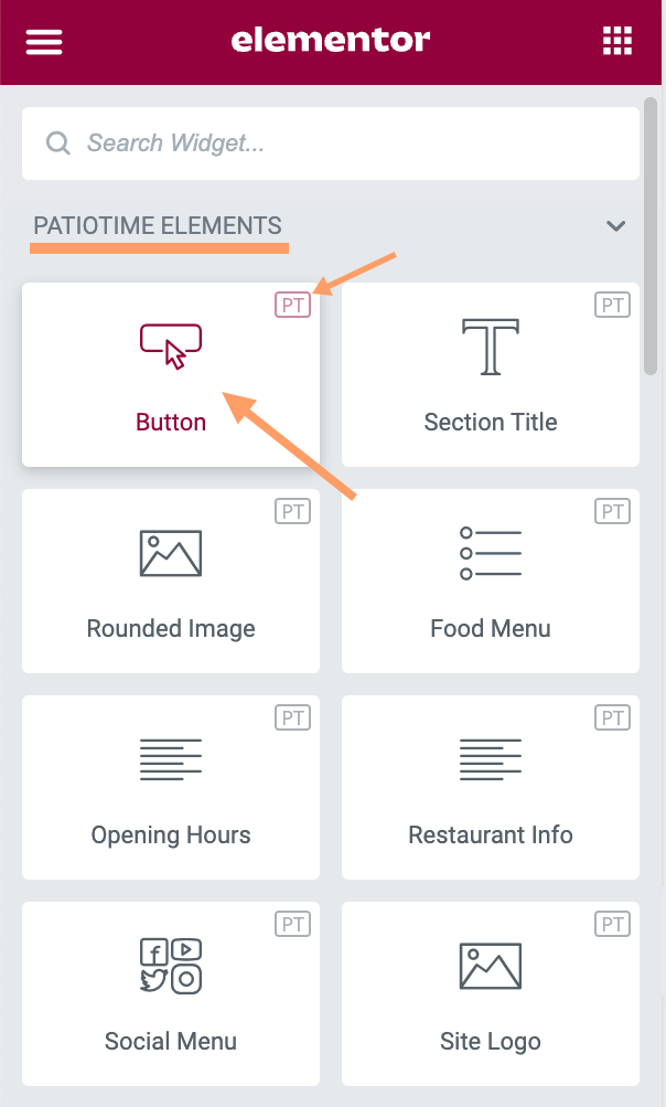
When editing a page with Elementor, you will find the “Button (PT)” element in the left panel. With this element, you can easily add buttons that inherit the theme’s built-in styles and customize them.
Content Tab
- Text: Enter the button’s text.
- Link: Set the URL for the button’s link. Click the cog to set the link to either open in a new window or to add rel=nofollow to the link.
- Alignment: Align the button to the left, center, right, or justified in relation to its column.
- Popup Box: Enable a popup after clicking the button. More details can be found in this tutorial.
Style Tab
- Button Style: Solid, Outline, Underline
- Button Shape: Default, Square, Rounded, Pill
- Button Size: Small, Medium, Large, Extra Large
- Button Color: Default, Primary, Secondary, Black, White, Custom
When selecting “Default” as Button Shape or Button Color, the related style will be inherited from the global settings (Customizer > Colors & Styles > Buttons).
When the Button Color is set to “Primary” or “Secondary”, it inherits the Primary Color or the Secondary Color set in Customizer > Colors & Styles > General Colors.
Therefore, if you would like to change the colors of several buttons on your website at the same time, you can check and change the relevant global settings in the Customizer > Colors & Styles section, and make sure that the color of these buttons is set to “Default” or “Primary” or “Secondary”.
If the button color is set to “Custom”, it will no longer be affected by the global settings.